|
|
Post by BaneTheDestroyer on Jun 7, 2015 8:18:58 GMT
It says "Ring War Federation," not Raw.  |
|
number1jf
Ricky Morton
 Administrator/Creative Team Member
Posts: 153 
|
Post by number1jf on Jun 7, 2015 8:22:27 GMT
There's just one thing I just noticed, it says "Offical" instead of "Official". Just fix that & I think we could use it to replace the logo at the top.
|
|
|
|
Post by BaneTheDestroyer on Jun 7, 2015 8:44:48 GMT
I personally think it may be too big. Too tall, not long enough. We can always try it first though!
|
|
SRI
Abdullah The Butcher
 Administrator/RWF Creative/RWF Writer
Avatar and sig credit to BaneTheDestroyer
Posts: 408 
|
Post by SRI on Jun 7, 2015 11:49:02 GMT
It says "Ring War Federation," not Raw.  Well, I mean in the "W" in RWF, "RAW" is written in black, like : R A W. EDIT: Stupid me. I figured out it says "Ring" in R, "WAR" in W (well, it's backwards, so I thought it was Raw) and "Federation" in F.  |
|
SRI
Abdullah The Butcher
 Administrator/RWF Creative/RWF Writer
Avatar and sig credit to BaneTheDestroyer
Posts: 408 
|
Post by SRI on Jun 7, 2015 11:50:27 GMT
I personally think it may be too big. Too tall, not long enough. We can always try it first though! Yeah, that's what I meant when I said "I wonder if it would fit, though".  |
|
ati "The Hero"
Owen Hart
 Administrator/RWF Graphics Designer
Please write ati with all low letters.
Posts: 683 
|
Post by ati "The Hero" on Jun 7, 2015 14:15:08 GMT
I like it ati. Looks really good. First of all, thanks to both of you. Also, Xman already gave the logo a green light over on FoS. Also, what is written on the logo with black "holes"? I can see RAW in "W". Just wondering.  It's suppeosed to read "Ring" in the R, "War" in the W, and "Federation" in the F. (But I only noticed that War can be misread for Raw after I made it. Could remake the logo so it definitely reads War if you'd want me to.) |
|
ati "The Hero"
Owen Hart
 Administrator/RWF Graphics Designer
Please write ati with all low letters.
Posts: 683 
|
Post by ati "The Hero" on Jun 7, 2015 14:17:18 GMT
I personally think it may be too big. Too tall, not long enough. We can always try it first though! Yeah, that's what I meant when I said "I wonder if it would fit, though".  I noticed the size problems. This is only a "view copy" if you'd want to call it that. (The spelling errors will be fixed when I'll make the version that fits.) I plan on making it 500x300, if that would fit. If not, I can always resize it. |
|
ati "The Hero"
Owen Hart
 Administrator/RWF Graphics Designer
Please write ati with all low letters.
Posts: 683 
|
Post by ati "The Hero" on Jun 7, 2015 14:49:49 GMT
Here's the resized, remade, actually spellchecked versions; 500x300:  850x450:  |
|
ati "The Hero"
Owen Hart
 Administrator/RWF Graphics Designer
Please write ati with all low letters.
Posts: 683 
|
Post by ati "The Hero" on Jun 7, 2015 14:55:29 GMT
Also made this for Jack;  (I'll have to work on the mouth.) And had some fun with Bob yesterday. (Only open the spoiler if you don't mind nightmares.) |
|
number1jf
Ricky Morton
 Administrator/Creative Team Member
Posts: 153 
|
Post by number1jf on Jun 7, 2015 18:59:15 GMT
Looks great ati, hopefully Bane or Sri can change the current header to your new one. I would, but I don't want to mess anything up as far as the site is concerned.
|
|
SRI
Abdullah The Butcher
 Administrator/RWF Creative/RWF Writer
Avatar and sig credit to BaneTheDestroyer
Posts: 408 
|
Post by SRI on Jun 8, 2015 13:23:27 GMT
|
|
|
|
Post by BaneTheDestroyer on Jun 8, 2015 18:26:01 GMT
Oh, surely, haha.
|
|
Deleted
Deleted Member
Posts: 0
|
Post by Deleted on Jun 18, 2015 22:00:31 GMT
I'm thinking about putting my custom graphics thread on here aswell
|
|
ati "The Hero"
Owen Hart
 Administrator/RWF Graphics Designer
Please write ati with all low letters.
Posts: 683 
|
Post by ati "The Hero" on Jul 7, 2015 12:15:26 GMT
Made this:  |
|
|
|
Post by BaneTheDestroyer on Jul 17, 2015 5:09:11 GMT
Made this:  I want to tell you this being as positive as I can be: Firstly, you've definitely improved from the beginning! Like a SHIT ton! This is showing me that you have enough time to actually learn, and I can see you wanna do your best. I can't say I'm the best either, I just want to give you another opinion. I love everything about this particular image, but there's one suggestion I have. Where you have a circle cutout in the middle of it, I recommend smudging the circle some, so it's not a perfect cutout circle. If you smudge it all the way around the edge of the circle, it helps add some imbalance to it, and us as humans kind of actually prefer imperfection rather than perfection when it comes to art. So, yeah, great job, and I hope it didn't come off as me being mean, but rather me congratulating and trying to give you a small piece of advice, haha. |
|
ati "The Hero"
Owen Hart
 Administrator/RWF Graphics Designer
Please write ati with all low letters.
Posts: 683 
|
Post by ati "The Hero" on Jul 17, 2015 10:39:12 GMT
Made this:  I want to tell you this being as positive as I can be: Firstly, you've definitely improved from the beginning! Like a SHIT ton! This is showing me that you have enough time to actually learn, and I can see you wanna do your best. I can't say I'm the best either, I just want to give you another opinion. I love everything about this particular image, but there's one suggestion I have. Where you have a circle cutout in the middle of it, I recommend smudging the circle some, so it's not a perfect cutout circle. If you smudge it all the way around the edge of the circle, it helps add some imbalance to it, and us as humans kind of actually prefer imperfection rather than perfection when it comes to art. So, yeah, great job, and I hope it didn't come off as me being mean, but rather me congratulating and trying to give you a small piece of advice, haha. Thanks. You didn't come off as mean at all. I messed up the circle cutout, I'll need to re-do that. I wanted them to be nearly touching the ring logo, and Lance's foot flied off into space, lol.Other than that, I may re-do the whole thing because of the circle cutout. Lance's foot is bugging me too much. And yeah, I try to do the best I can. Though, I can't do a lot with the CS1 Photoshop. But eh, I have what I wanted. All I miss a blood tool, but eh. |
|
|
|
Post by DarkSideDangerously on Jul 17, 2015 14:47:06 GMT
I wish I had Photoshop.It would make graphics making tons more easier for me.
|
|
ati "The Hero"
Owen Hart
 Administrator/RWF Graphics Designer
Please write ati with all low letters.
Posts: 683 
|
Post by ati "The Hero" on Jul 24, 2015 22:21:58 GMT
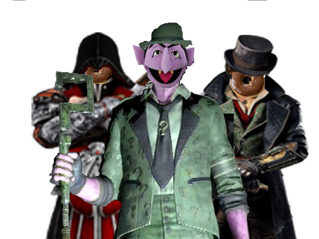
Updated Count Riddler avatar, now featuring two members of The Donut Army.  |
|
|
|
Post by DarkSideDangerously on Jul 25, 2015 4:08:57 GMT
Noones requesting me to make anything and I'm a whore so...
DON'T FORGET TO GO TO MY LOGO THREAD EVERYBODY!!!
|
|
ati "The Hero"
Owen Hart
 Administrator/RWF Graphics Designer
Please write ati with all low letters.
Posts: 683 
|
Post by ati "The Hero" on Jul 25, 2015 8:53:21 GMT
Noones requesting me to make anything and I'm a whore so... DON'T FORGET TO GO TO MY LOGO THREAD EVERYBODY!!!Boobie Dangerassly, ati's #2396418573 strikes again. |
|